Case study for Weir, 2021 to 2022

Proactive Journeys: A faster and simpler way for users to get access

A feature that provides self-service sign-up and access requests for Weir's Customer Portal. I took it from discovery to a shipped, tested release.
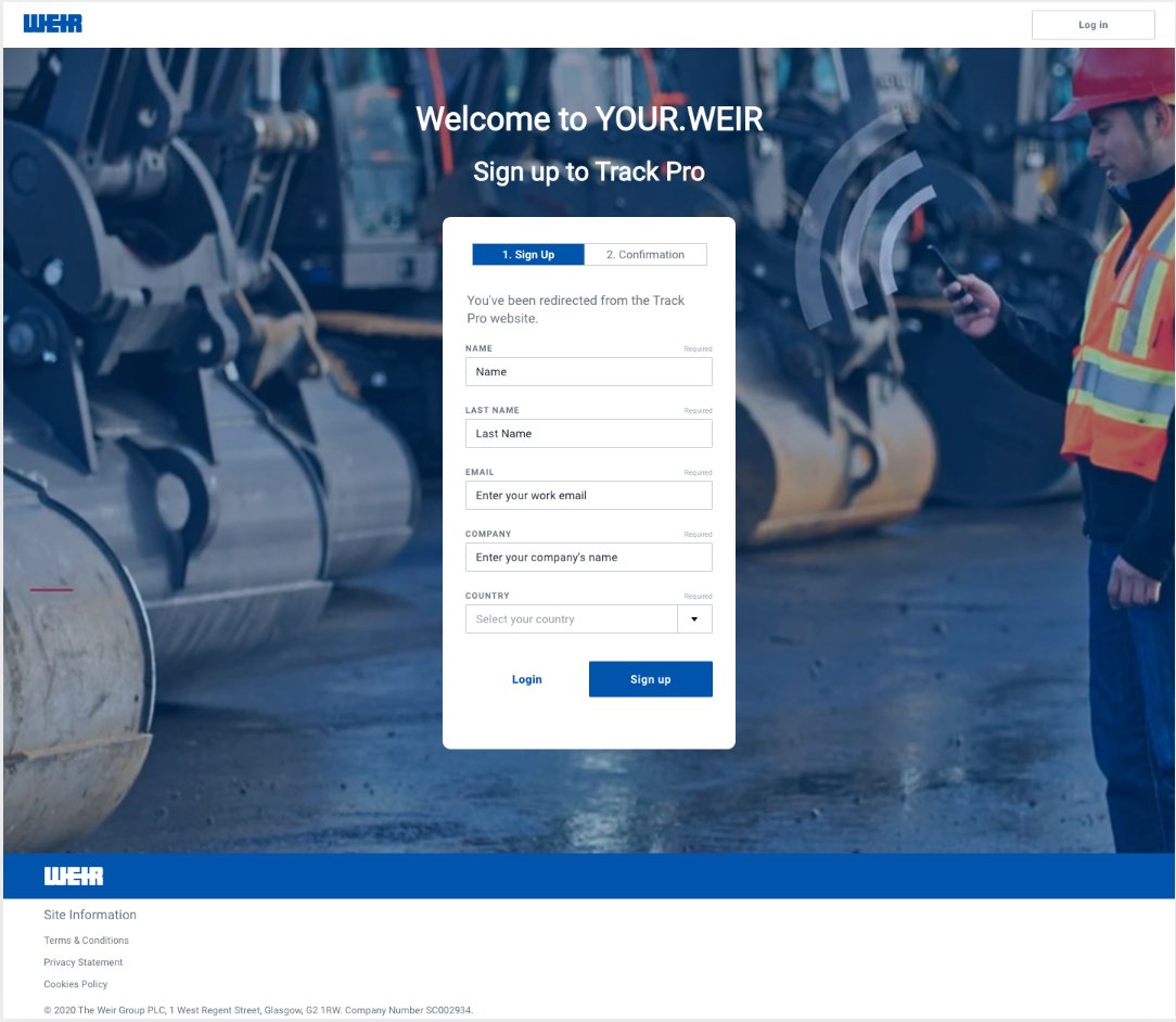
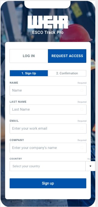
Sign-up screen for YOUR.WEIR over an industrial site photo

Key success metrics

2 steps
Down from around 8

Sign up, then request access. What used to run through several people and manual checks now takes two steps from the user.

10 minutes
Average, down from weeks

Roughly how long it takes, in an ideal case, for a user to sign up, request access, and get approved.

95%
Average adoption

Average adoption of the self-service journeys, with invitations still used for a small set of strategic accounts.
The task

The only way in was an invitation

Getting access meant asking a team leader or account manager, who emailed an App Manager, who worked through several manual checks before sending anything. I designed a self-service layer that replaces most of that, while keeping invitations for the accounts that sales is actively managing.

Request by email chainRequest in the portal
Days to weeks to hear back10 minutes on average
Invitation only onboardingSelf-service, invitations kept for strategic accounts

Who it served

Three roles. Not the same problem

End User / Viewer

Just needs into an app. Often didn't know how to ask, or who the App Manager even was.

App Manager

Reviews and assigns access for their own apps, manually, per user, per site.

App Admin / Owner

Same job as a Manager, across every app a business entity owns.

The process

Ten stages, run once, then looped per release

Understanding the system first, then the users, then the build. Each stage feeding the next.

1

Understanding IAM

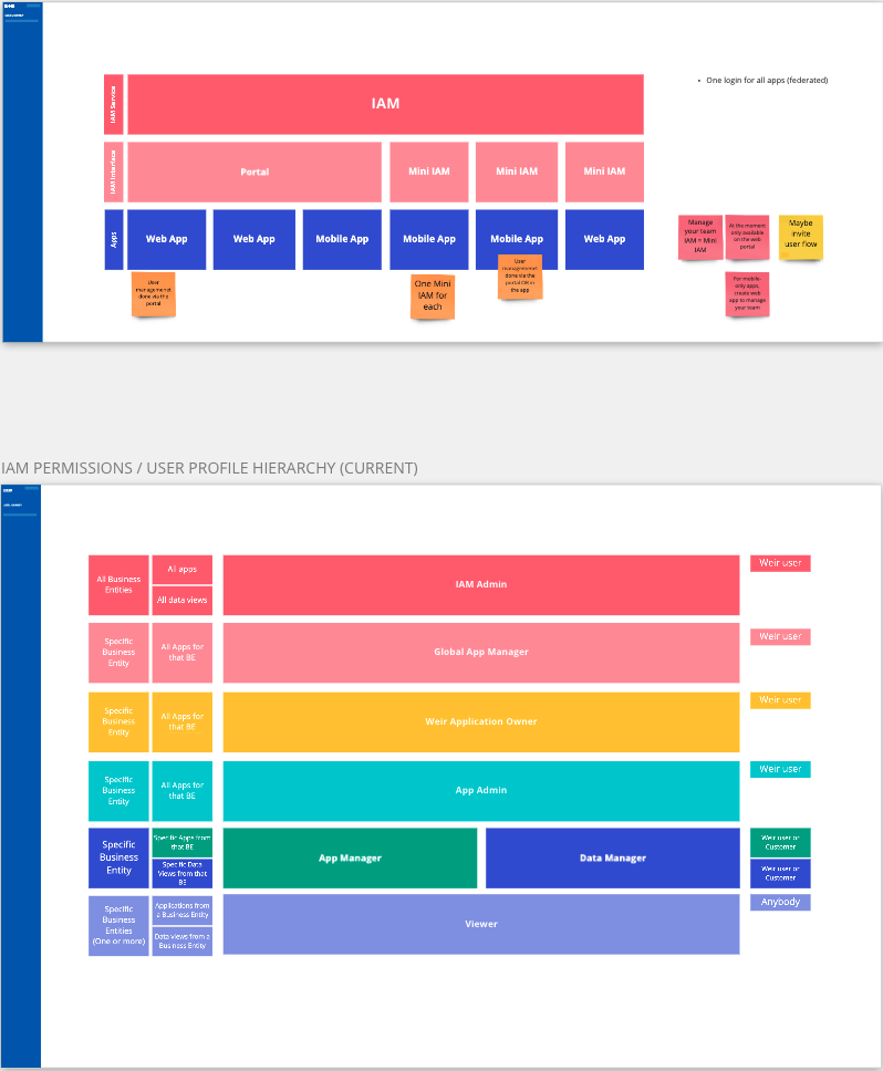
  • One IAM service, a portal, and a "mini IAM" behind every app
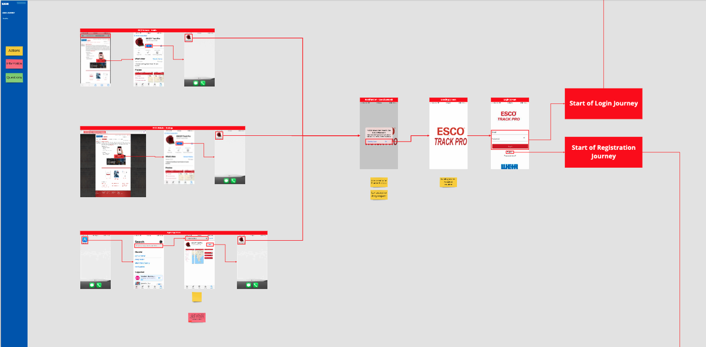
  • Mapped the existing login and registration journeys first
IAM ecosystem and permission hierarchy diagram
Existing login and registration journey map
2

Talking to users

  • End users were hard to reach early on, so I started with global App Managers
  • They review requests constantly, close enough to speak for the users on the other side
3

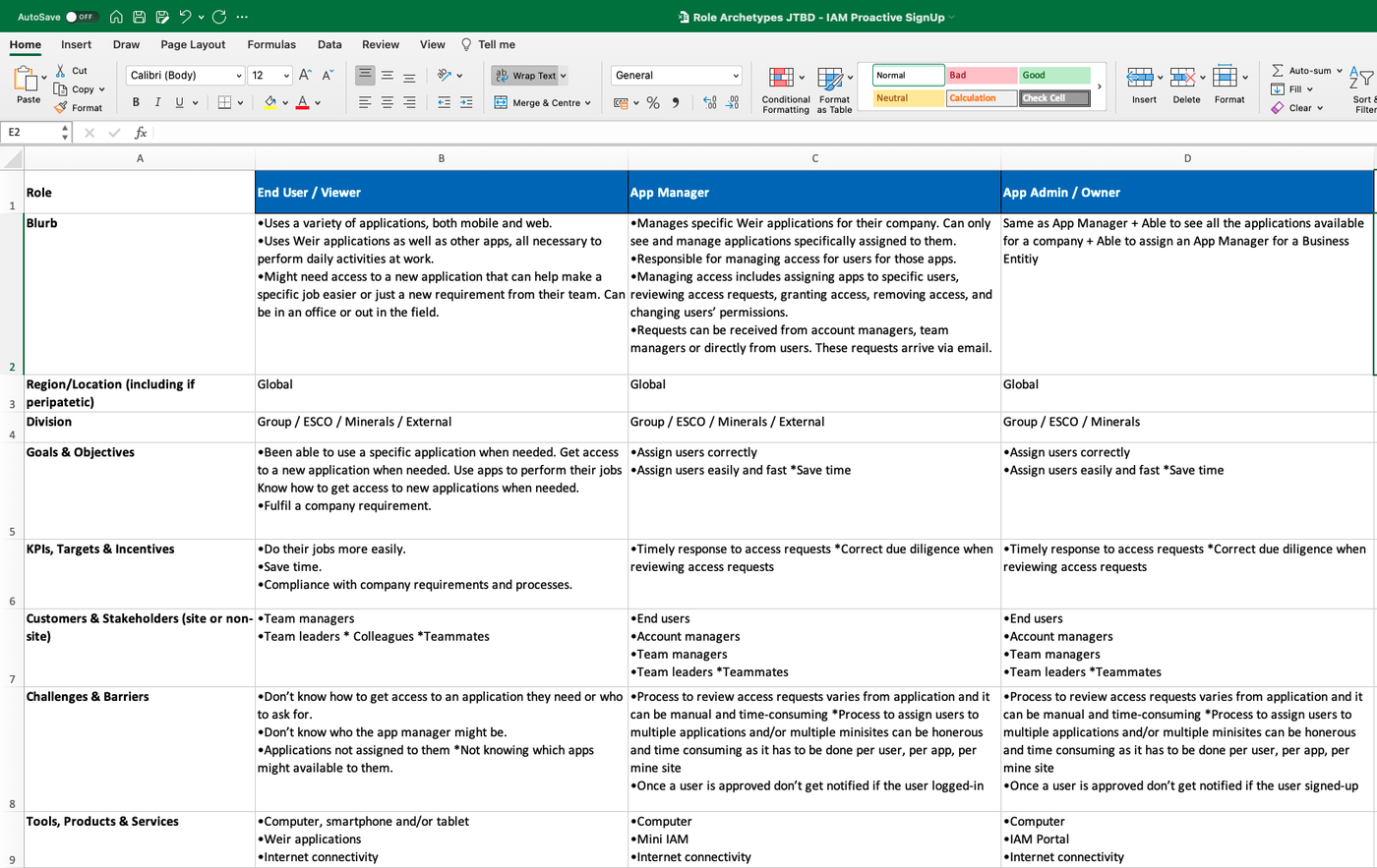
Define role archetypes

  • Not all users are the same, broke each one down by goals, tools, and where they got stuck
Spreadsheet of role archetypes
4

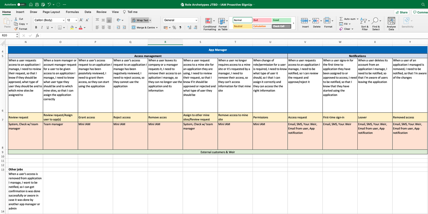
Jobs to be done

  • Identified the jobs, then grouped and categorised them
  • Started in a spreadsheet on purpose, no new tool needed to begin
Jobs to be done spreadsheet
5

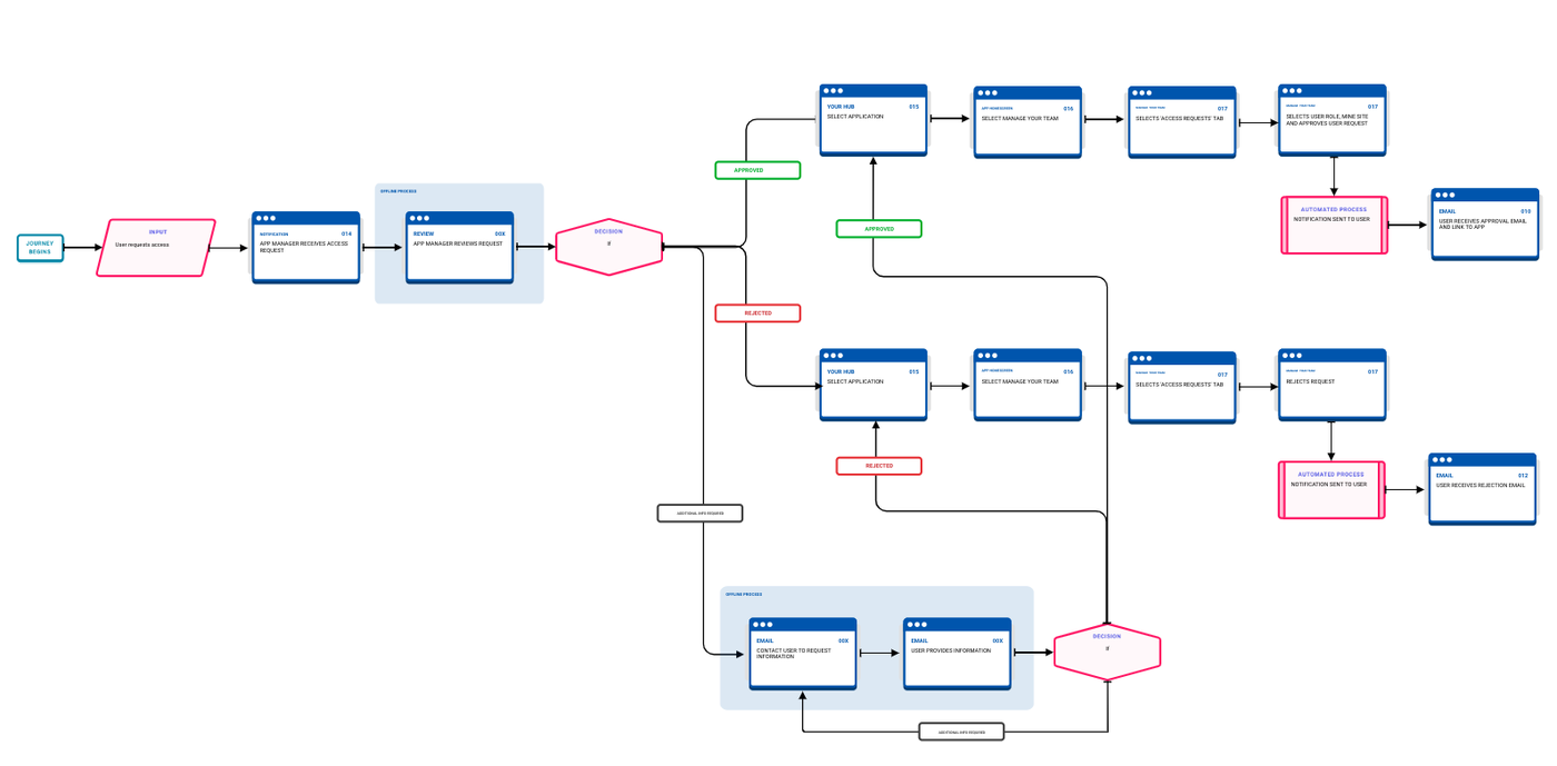
UX architecture

  • Mapped every branch: sign-up through approval or rejection, web and mobile
UX architecture flowchart
6

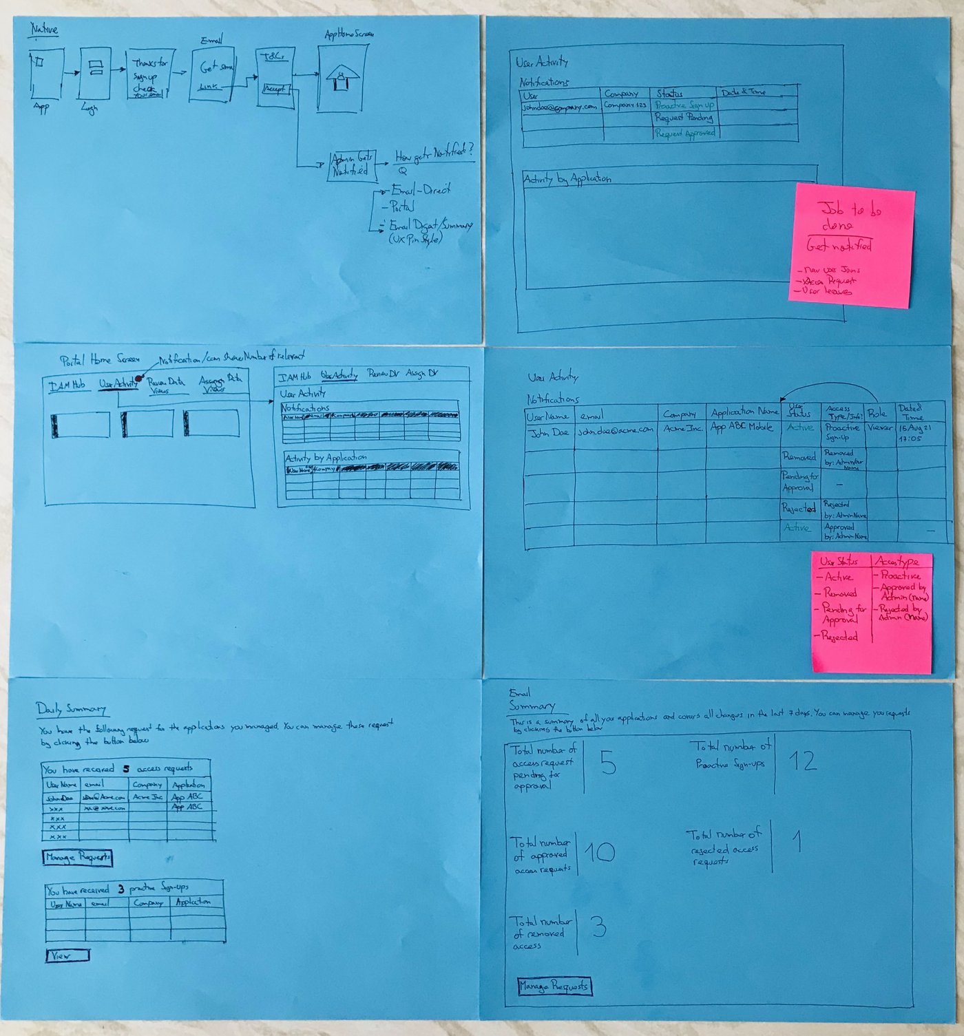
Ideation: sketches, then wireframes

  • Paper first: fast, disposable, easy to argue with
  • Into low-fidelity wireframes once a screen was worth testing properly
Photographed paper sketches
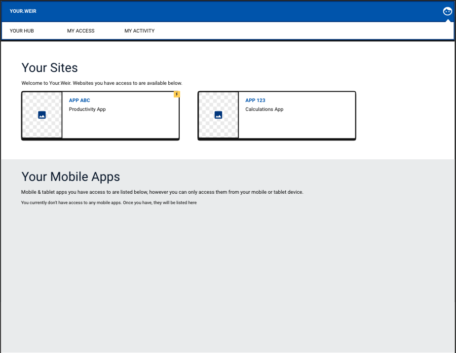
Low-fidelity wireframe of Your Sites
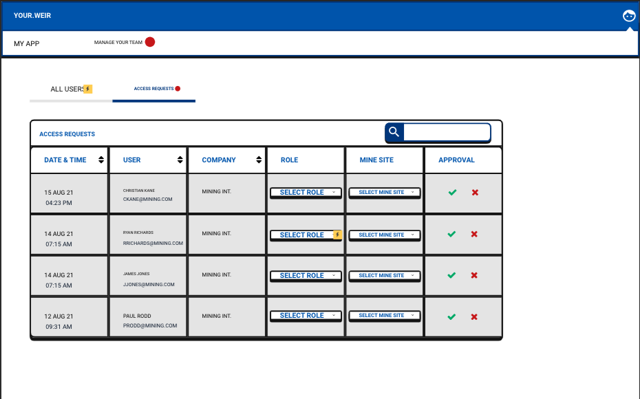
Low-fidelity wireframe of IAM Hub
7

High-fidelity prototype

  • Full fidelity, desktop and mobile, on Weir's actual UI. This had to feel shipped, not conceptual
Mobile sign-up screen
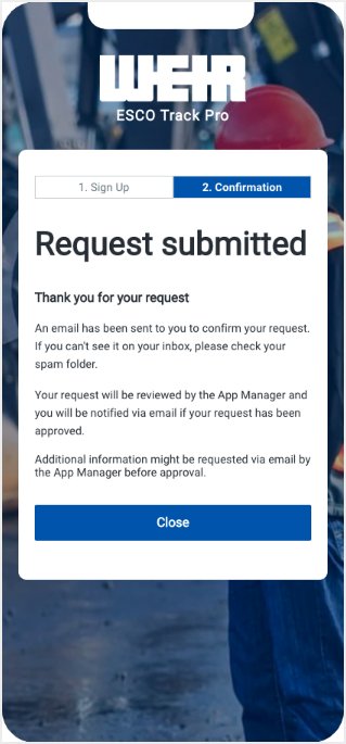
Mobile request submitted screen
Mobile screen showing the user is already signed up
8

Usability testing

  • Sessions of around 60 minutes, synthesised into a report stakeholders could actually read
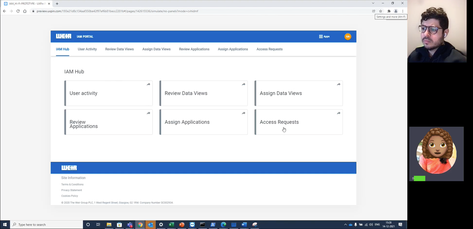
Usability test session on IAM Hub, with participants on camera
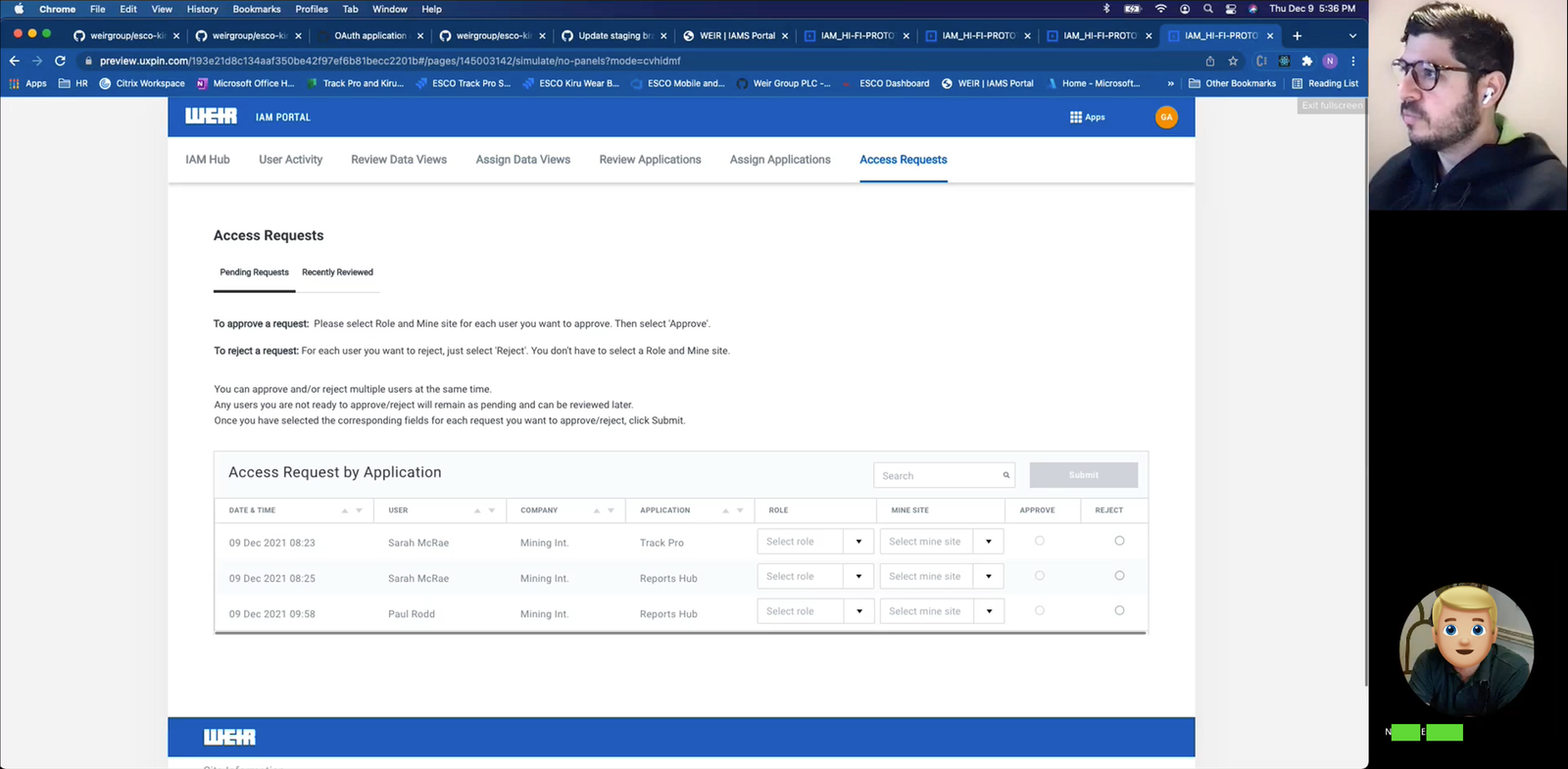
Usability test session on Access Requests, with participants on camera
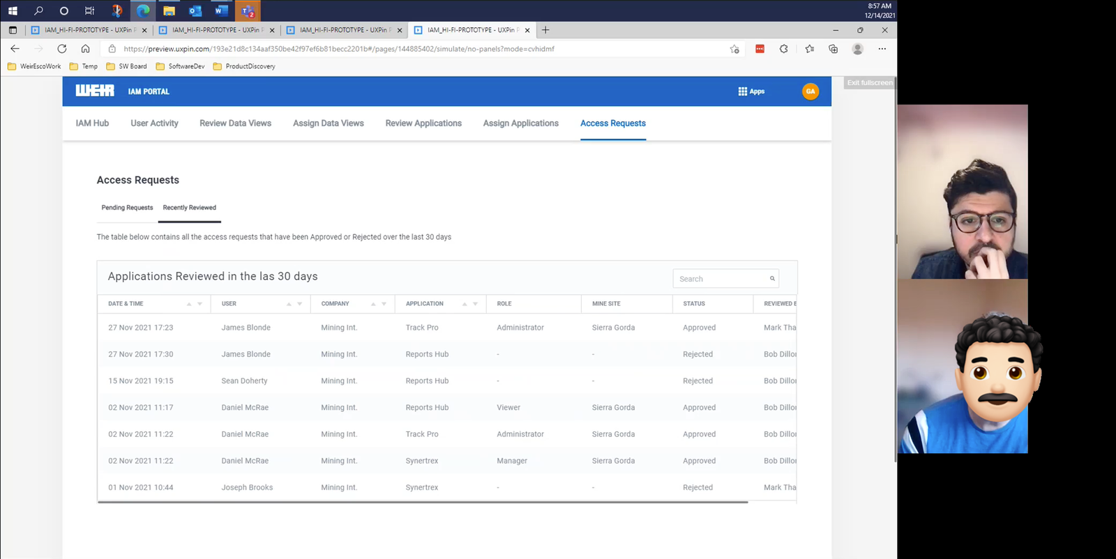
Usability test session on Recently Reviewed, with participants on camera
Real example

A senior stakeholder asked, quite firmly, for a button to be removed. In their view it was one less step, easier for the user, and easier to build. It was an opinion, not evidence. Testing showed the opposite: users wanted that extra validation, not less of it. I brought the sessions that proved it, and the stakeholder backed down. We kept the button.

9

Backlog

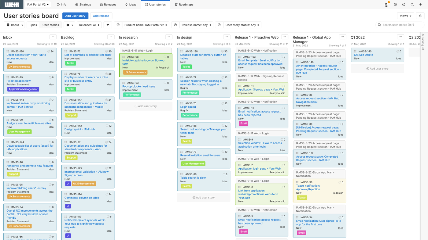
  • Every story: description, user story, prototype link, screenshots per state, acceptance criteria
Kanban backlog board
10

Feedback loop

  • Develop, test, validate. Next item off the backlog, repeat
  • Shipped in order: global App Manager + web, then email, then mobile, then standard App Manager

Outcome

We gained speed. But also clarity and visibility (which are as important)

The overall process is faster and simpler. However, it's the clarity and the visibility that I consider valuable, or even more, than the speed. We now have a clear journey for the end-users, in a well-defined process for their organisation (Business Users, Application Teams, Sales Teams, Stakeholders).

This means that everybody knows how it needs to be done, and if something happens, a problem is easy to resolve. Not getting in the way of users getting access to what they need, which ultimately is what we're striving towards.